
BigCommerce powers the successful websites of major brands, showcasing the limitless capabilities of this eCommerce platform.
From crafting online boutiques for fashion labels to establishing expansive electronics emporiums, BigCommerce accommodates all.
The greatest perk? No prior web development experience is necessary to bring these visions to life.
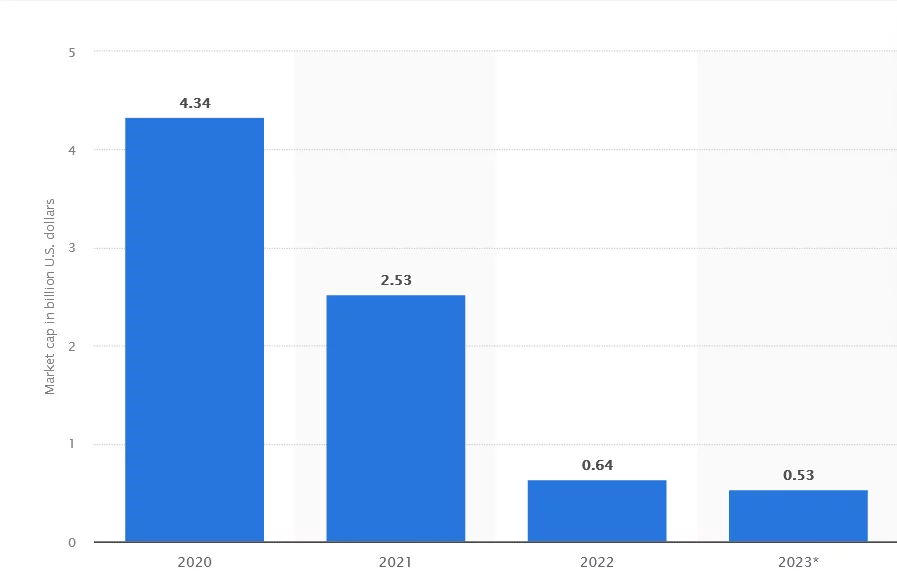
Source: Market capitalization of BigCommerce from 2020 to 2023 (in billion U.S. dollars)
Features That Make BigCommerce Successful:
1. Flexibility and Scalability:
BigCommerce’s success in catering to both small businesses and large enterprises stems from its scalable architecture. This scalability allows businesses to expand their operations without being hindered by technological constraints. Whether a business is starting small and gradually growing or is already a large enterprise, BigCommerce accommodates varying needs. This flexibility extends to customization options, enabling businesses to tailor their online stores to suit their unique branding and operational requirements.
2. Feature-Rich Environment:
The platform’s success is also rooted in its feature-rich environment. BigCommerce offers an extensive array of built-in features that are essential for running an e-commerce store effectively. These include:
- Responsive Themes: Ready-to-use, mobile-responsive themes that enhance the user experience across devices.
- SEO Tools: Built-in SEO features that help optimize product pages and improve visibility on search engines.
- Marketing Integrations: Seamless integrations with various marketing tools and platforms for effective promotional activities.
- Robust Analytics: In-depth analytics and reporting tools that provide valuable insights into sales performance, customer behavior, and more, aiding in informed decision-making.
These features collectively empower businesses to create user-friendly, efficient, and visually appealing online stores without requiring extensive technical expertise.
3. Performance and Security:
BigCommerce’s success also hinges on its commitment to site performance and security. The platform ensures fast loading times and reliable uptime for an optimal user experience. It achieves this through various means such as optimized hosting infrastructure, content delivery networks (CDNs), and caching mechanisms. Moreover, robust security measures, including SSL certificates, PCI compliance, regular security updates, and fraud protection, safeguard customer data, fostering trust and confidence among users.
4. Support and Community:
An essential aspect of BigCommerce’s success lies in its comprehensive support system and active community engagement. The platform provides extensive documentation, tutorials, and customer support to assist users in setting up and managing their stores effectively. Additionally, the vibrant community allows users to interact, share insights, troubleshoot issues, and access resources for enhancing their online stores. This collaborative environment fosters continuous learning and improvement among users.
Learn about more ecommerce platforms here.
Real Life Cases of BigCommerce Success:
1. Skullcandy
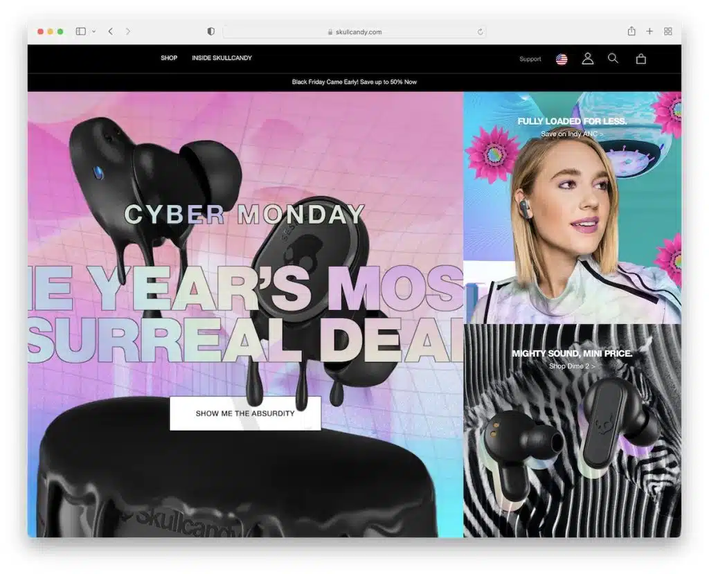
Skullcandy’s home page stands out with its sleek grid-style layout, strategically highlighting enticing special deals, trending products, and additional content to captivate visitors.
In a departure from the norm for eCommerce platforms, their approach leans towards a simplicity that’s refreshing and distinctive. This minimalist design creates an unconventional yet engaging user experience, setting them apart in the online retail landscape.
What adds to the user-friendly nature of the site is the interactive navigation feature. By simply hovering over the navigation options, users can seamlessly access the mega menu. This menu facilitates effortless exploration, enabling visitors to effortlessly navigate to the shop or any other section that piques their interest.
This clever utilization of the home page serves as a prime avenue for showcasing exclusive deals, top-selling items, and other trending products, maximizing the exposure of these hot commodities to potential buyers.
Note: The strategic use of the home page’s layout not only enhances user experience but also serves as a powerful tool for promoting exclusive deals, best sellers, and other sought-after products, contributing significantly to Skullcandy’s online success.
2. Black Diamond
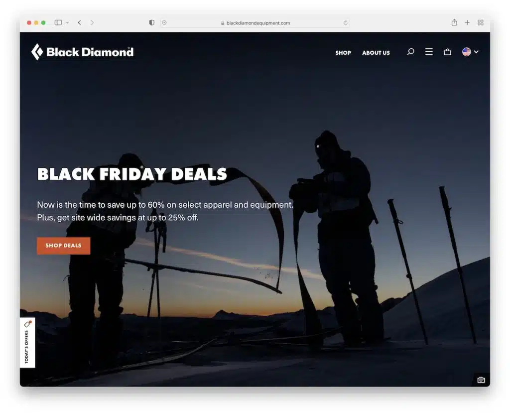
Black Diamond takes a contrasting approach to Skullcandy’s simplistic home page. It’s a complete divergence, boasting a dynamic design that captures attention right from the full-screen image accompanied by compelling text and a clear call-to-action (CTA) button. This approach extends across multiple sections, each strategically dedicated to promoting diverse products, ongoing sales, and other enticing content.
What further distinguishes Black Diamond’s home page is the inclusion of a dedicated section offering a sneak peek into their Instagram profile. This section not only showcases their social media presence but also provides visitors with an option to seamlessly visit and follow their IG account, fostering a deeper connection with their audience.
However, the standout feature that piques interest is the creative use of a mountain outline, effectively dividing the base of the home page from the footer area. This unique visual element adds a touch of character and reinforces the brand’s outdoor, adventurous identity.
This elaborate home page layout serves as a central hub for promoting a myriad of items, amplifying their social media reach, and more, showcasing Black Diamond’s diverse offerings and engaging with their audience on multiple levels.
Note: Black Diamond’s dynamic home page layout offers a compelling showcase for diverse products, social media interaction, and more, acting as a central hub to captivate visitors and enhance engagement with the brand.
3. La Perla
La Perla’s home page epitomizes modernity and minimalism, showcasing a split-screen hero section that effortlessly grabs attention. On one side, a captivating display of their exquisite lingerie steals the spotlight, while the other side hosts an elegant text slider, adding depth and allure to the overall aesthetic.
The design exudes a sense of opulence and luxury, mirroring the sophistication that defines their products. Every element, from the layout to the choice of imagery and typography, exudes a refined and upscale ambiance, perfectly aligning with the premium quality La Perla is known for.
By meticulously crafting a website that embodies opulence, La Perla elevates the online shopping experience for their high-end clientele. The sleek and lavish design doesn’t just showcase their products; it envelops visitors in an atmosphere of luxury, mirroring the exclusivity and elegance that define the brand.
Note: Emulating the opulence of their high-end offerings, La Perla’s website design exudes luxury, creating an immersive experience that resonates with the sophistication and elegance synonymous with their brand.
4. Oral-B
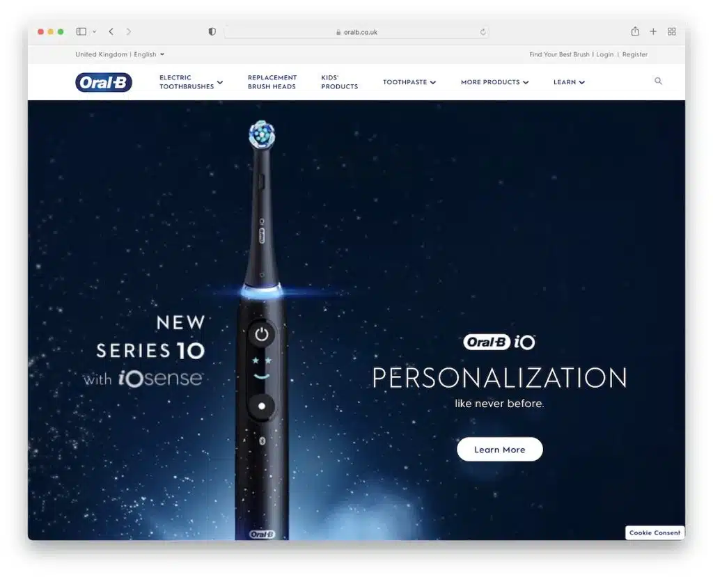
Oral-B’s home page employs a sizable slider adorned with vibrant text, serving as a powerful magnet to captivate user attention right from the start.
Beyond the striking slider, the home page is meticulously crafted with multiple sections strategically dedicated to product promotion and highlighting the myriad benefits of their brushes.
While the abundance of content might seem overwhelming at first glance, the deliberate incorporation of ample white space meticulously balances the layout, ensuring a harmonious and pleasant user experience. This strategic use of white space allows each section to breathe, preventing visual clutter and ensuring a smooth navigation flow.
The large slider emerges as a stellar solution, serving as a catalyst for arousing curiosity and enticing users to explore further. It’s a gateway that entices visitors to delve deeper into the myriad offerings and benefits showcased throughout the page.
Note: Oral-B’s adept use of a large slider on their home page acts as an effective tool to ignite curiosity, complemented by the strategic use of white space, ensuring an engaging and user-friendly browsing experience.
5. Ted Baker
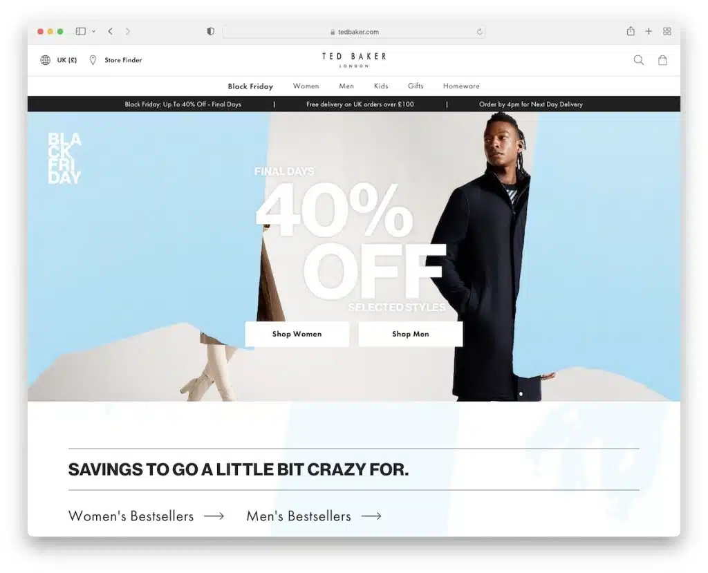
Ted Baker’s hero section stands as a rare gem in the realm of website design, instantly captivating attention, particularly when highlighting ongoing promotions. It’s a focal point that commands immediate focus and curiosity.
But that’s just the beginning of what makes Ted Baker’s website stand out. The innovative elements are in abundance – a sleek and unobtrusive floating header that maintains a minimalist charm, a stylish slider that effortlessly showcases their offerings, and the bold choice of incorporating a video background, setting a dynamic and engaging tone.
Adding to the interactive experience is the option to subscribe to their newsletter, allowing users to tailor their interests by selecting male or female product news. This personalization ensures visitors receive relevant updates, enhancing their connection with the brand.
What truly sets Ted Baker apart is their fearlessness in incorporating animations and videos tastefully. These elements, seamlessly woven throughout the site, elevate the user experience without overwhelming or distracting. They serve to enrich the storytelling and create an immersive environment, making the browsing journey not just informative but also visually captivating.
Note: Ted Baker’s website sets a benchmark by tastefully incorporating animations, videos, and interactive elements like a newsletter subscription, contributing to a captivating and personalized browsing experience that reflects their commitment to engaging storytelling and innovation.
6. King Arthur Baking
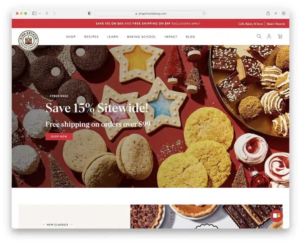
King Arthur Baking’s home page tantalizes the senses with an abundance of delectable images that practically make your mouth water upon arrival.
What sets King Arthur Baking apart is their skillful approach in creating a home page that doesn’t come off as overtly sales-driven. Instead, it’s a delicate blend of enticing visuals and informative content that seamlessly interweaves products and engaging material. This strategic mix ensures visitors linger longer, drawn in by both the allure of the products and the valuable content presented.
One standout feature contributing to the site’s user-friendly experience is the sticky menu, a constant companion that remains readily accessible for users to take action whenever they desire. This unobtrusive yet omnipresent navigation tool empowers users to explore effortlessly without interrupting their browsing flow.
Adding to the site’s allure is the subtle yet captivating animated logo change in the header as users scroll. It’s a small detail, but one that significantly elevates the overall aesthetic appeal, adding a touch of innovation and visual interest to the browsing experience.
Note: King Arthur Baking’s strategic blend of products and content on their home page ensures a captivating and informative experience, enticing visitors to explore longer, complemented by subtle yet engaging elements like the sticky menu and animated logo change.
7. Gillette
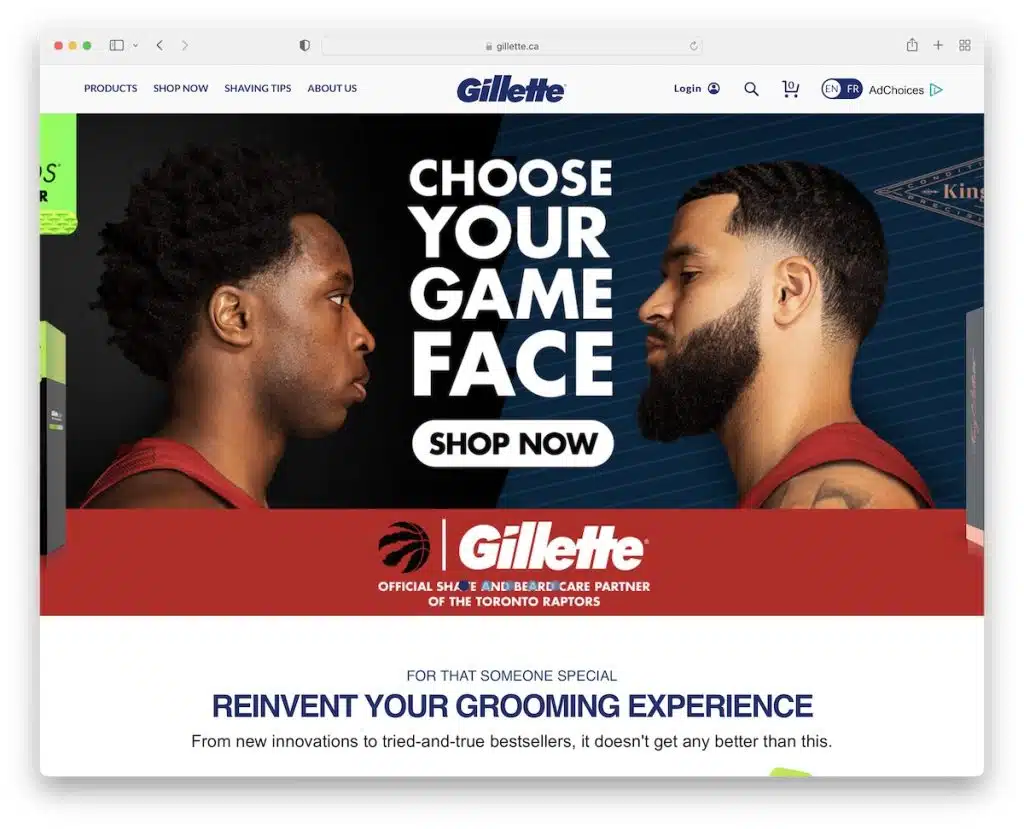
Gillette’s website, powered by BigCommerce, embodies modernity through its clever amalgamation of features. The home page is a testament to this, boasting a slider that dynamically draws attention, a seamlessly integrated floating header for easy navigation, and a savvy grid-style layout showcasing images and text with compelling call-to-action (CTA) buttons, inviting visitors to explore their shop effortlessly.
One striking element contributing to Gillette’s user engagement strategy is the subscription form strategically positioned to capture visitor emails. This form serves as an invitation for users to sign up and stay updated on exclusive offers and the latest updates. By encouraging visitors to enter their email addresses, Gillette efficiently builds an email list, setting the stage for future promotional campaigns and fostering a direct channel for engaging with their audience.
The website’s layout and functionalities work cohesively to create a user-friendly experience that not only showcases Gillette’s products but also actively encourages visitor interaction and engagement. Through the subscription form, Gillette not only seeks to provide value to its audience but also aims to establish a lasting connection for future promotions and communication.
Note: Gillette’s strategic inclusion of a subscription form on their website serves as a powerful tool to build an email list, facilitating future promotional activities and fostering a direct line of communication with their audience.
8. Beer Cartel
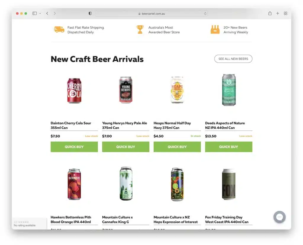
BigCommerce proves its versatility yet again through Beer Cartel, showcasing how effectively beer sales can thrive within its framework.
Beer Cartel’s home page stands as a testament to their adept utilization of various engaging features. Among the standout elements is the distinctive “get my code” popup, a clever interactive addition that entices visitors, perhaps offering exclusive discounts or access to unique deals, fostering a sense of exclusivity and engagement.
Adding to the interactive experience is the incorporation of an Instagram feed, a dynamic touch that not only provides a visual glimpse into their social media presence but also bolsters authenticity and community engagement.
Moreover, the “as featured in” section serves as a badge of honor, highlighting the brand’s credibility and association with notable publications or platforms, instilling trust and confidence in potential buyers.
Beer Cartel’s strategic use of these features on their home page not only enriches the browsing experience but also contributes to a multifaceted and immersive online environment. By integrating an Instagram feed, they seamlessly bridge their website with their social media presence, creating a cohesive and engaging platform that resonates with beer enthusiasts.
Note: Beer Cartel’s inclusion of interactive features like the “get my code” popup and an Instagram feed, alongside credibility markers like the “as featured in” section, enhances engagement and authenticity, enriching the overall website experience and connecting with beer lovers on multiple levels.
9. Davidoff Of Geneva

Davidoff Of Geneva, leveraging the BigCommerce platform, excels in simplicity and professionalism, setting a benchmark for streamlined yet sophisticated websites. The floating header section is a prime example, commencing with a notification bar prominently showcasing their enticing offer of free shipping. This strategic placement instantly captures attention and entices visitors to explore further.
Continuing down the header, the eCommerce essentials are seamlessly integrated, presenting users with easy access to must-have features, a comprehensive mega menu for effortless navigation, and a conveniently positioned search bar, enhancing user experience and accessibility.
However, what truly sets Davidoff Of Geneva apart is their commitment to inclusivity and user customization. Their unique accessibility menu is a standout feature, providing users with the ability to tailor the site according to their preferences and accessibility needs. This menu empowers visitors to adjust settings, ensuring a personalized and accommodating browsing experience for individuals with diverse requirements.
By embracing this robust accessibility menu, Davidoff Of Geneva not only demonstrates a dedication to inclusivity but also showcases a forward-thinking approach to website design. It ensures that every visitor, regardless of their abilities, can navigate and engage with the site comfortably and efficiently.
Note: Emulate Davidoff Of Geneva’s commitment to inclusivity by incorporating an accessible settings menu on your website, allowing users to customize their browsing experience and ensuring everyone can navigate your site comfortably.
Conclusion:
Successful BigCommerce sites are more than just a collection of products online—they’re a symphony of well-planned strategies, technological prowess, and customer-centric approaches. These sites thrive due to BigCommerce’s multifaceted support, from its flexible scalability accommodating businesses of all sizes to its feature-rich environment empowering user-friendly experiences. Coupled with top-tier performance and security measures and a supportive community, these factors harmonize to orchestrate the success of BigCommerce sites. Ultimately, their success is a testament to the platform’s ability to enable businesses to not just exist but excel in the digital realm, offering seamless, secure, and captivating shopping experiences for customers worldwide.
FAQs on Successful BigCommerce Sites:
How can I optimize my BigCommerce site for better performance?
Optimizing images, enabling caching, and leveraging Content Delivery Networks (CDNs) can enhance site speed. Regularly updating themes and plugins, minimizing redirects, and employing responsive design practices can also improve performance.
What marketing tools does BigCommerce offer?
BigCommerce integrates with various marketing tools such as email marketing platforms, social media integrations, Google Analytics, SEO tools, and advertising platforms like Google Ads and Facebook Ads.
Can I customize my BigCommerce store extensively?
Yes, BigCommerce allows extensive customization through its themes, templates, and access to HTML, CSS, and JavaScript. Additionally, it supports integrations with third-party apps and tools to expand functionality.
Is BigCommerce suitable for small businesses?
Yes, BigCommerce caters to small businesses with its scalable pricing plans, robust features, and user-friendly interface, making it suitable for businesses of various sizes.
