The About Us page tells a lot about a company or individual blogger who’s just starting out. If you’re a business owner or blogger, it is important to create an About Us page. You might be asking yourself, Hoo, every website on the internet has an About Us page. What’s so important about it?
The very aspect of the About Us page is to tell a story—the journey, ‘how it started’. It’s about the people and the inspiring work everyone has done to get your business running. Everyone has ideas; some are vivid, and some are more realistic. Some want their story to be told in different ways, styles, manners, or ideas. Prerequisite for a fabulous About Us page: theme page that best showcases your brand on this page.
So this article will help you shape your About Us page using some creative ideas and an inspiring About Us Template.
Creative Ideas for the About Us Page
While everyone has their own version of creative ideas to use while creating a web page, sometimes it’s best to take a peak of inspiration from someone just for an idea. So here are 5 of my ideas for your About Us page inspiration.
Each of these ideas is different from one another, and so each idea contains a different style and content, so pick the one that suits you the best.
Whimsical Wonderland of Kids – About Us Page
If you are looking for a pink style, such as child products, then this style is for you.
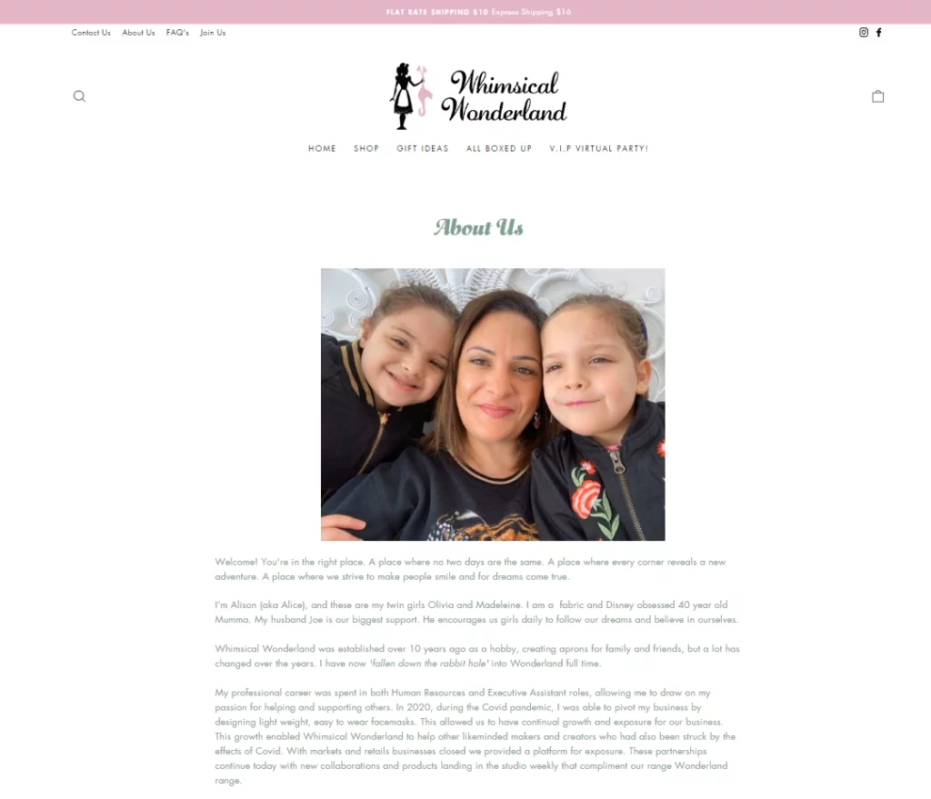
- Fonts: Lobster, Pacifico, Comic Sans MS
- Colors: Cotton Candy Pink (#FFB6C1), Minty Fresh (#98FF98), Sunshine Yellow (#FFFF00)
- Images: Enchanting illustrations and team members in costume
- Video: Stop-motion animation with a magical theme
- Graphics: Sparkles, rainbows, and unicorns
- Storytelling: Narrate the company’s story through a whimsical fairy tale.
Glamorous Hollywood – About Us Page
Whenever I hear the word glamorous, the immediate image that comes to mind is of some Hollywood celebrity walking on the red carpet.
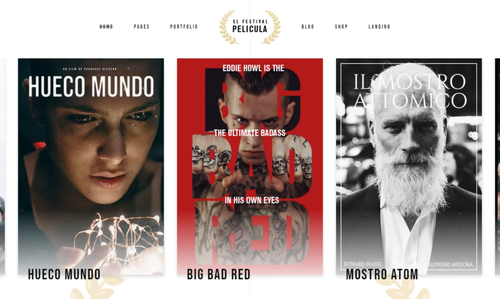
- Fonts: Raleway, Bungee, Playfair Display
- Colors: Red Carpet Red (#FF4500), Golden Spotlight (#FFD700), Black Tie (#151f28)
- Images: Glamorous shots of the team and company events
- Video: Behind-the-scenes footage of product launches and award ceremonies
- Graphics: Film reel motifs and gold accents
- Storytelling: Frame the company’s history as a blockbuster success story.
Tech Noir – About Us Page
If you don’t know what Tech Noir is, don’t worry. The term tech noir word is used to describe the cyberpunk-style genre of fiction like in the Future in 2077.
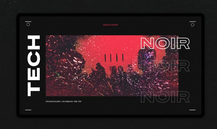
- Fonts: Roboto, Exo, Teko
- Colors: Cyberpunk Purple (#8A2BE2), Neon Laser (#00FF00), Metallic Silver (#C0C0C0)
- Images: Futuristic cityscapes and employees with cyber enhancements
- Video: Sci-fi-inspired visuals showcasing cutting-edge technology
- Graphics: Holographic elements and glitch effects
- Storytelling: Present the company as a pioneer in the tech revolution.
Vintage Traveler – About Us Page
This list is incomplete without a travel theme. These styles of themes make a perfect blend for ready-to-go travelers and bloggers.
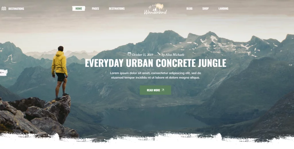
- Fonts: Oswald, Great Vibes, Courier New
- Colors: Dusty Map (#C0CBBF), Old Postcard (#D6C9A5), Adventure Brown (#A07049)
- Images: Retro travel photos and team members dressed in vintage attire
- Video: Montage of the team exploring different locations
- Graphics: Compasses, stamps, and old-world typography
- Storytelling: Share the company’s journey as a globe-trotting adventure.
Retro Gaming – About Us Page
Who doesn’t love games, retro style will surely bring back those moments when retro games were popular.
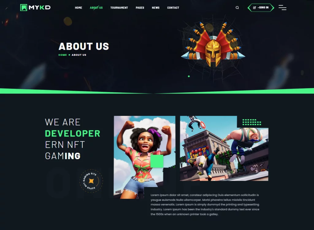
- Fonts: Press Start 2P, Pixel Arial 11, Good Times
- Colors: Pixel Art Red (#FF0000), 8-Bit Blue (#0000FF), Retro Yellow (#FFFF00)
- Images: Pixel art characters of team members and classic arcade scenes
- Video: Montage of gameplay from iconic retro games
- Graphics: Space invaders, Tetris blocks, and old-school fonts
- Storytelling: Frame the company’s history as a journey through gaming nostalgia.
Now that you have explored creative ideas for the About Us page, let’s continue with the About Us page template.
10 Best Inspiring About Us Page Template
Jam3
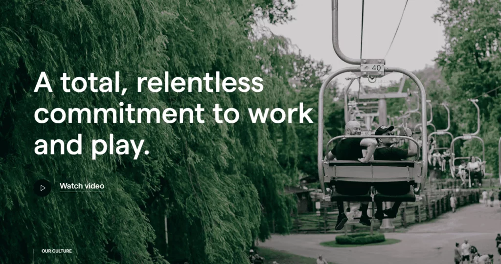
Jam3’s culture is a perfect example of modernity and simplicity; they convey their message by using UI and images. Another great part of their site is that individual team photographs are a common topic for About Us pages, but why not think about gathering everyone for a big group shot instead?
This Jam3 about page does that by making their squad the initial focal point of a sizable, elegant photograph. This image is brilliantly contrasted with a straightforward style and carefully positioned typography, which together create an unquestionably chic and classy page.
Mixd – Bold words and Large Photo
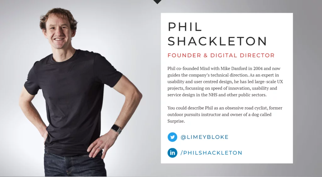
Want to leave a lasting impression with your design? To build something huge and bold, think about scaling it up a bit. The lettering on the header picture is predominantly scaled up in this design by Mixd, and near-full-screen photos are also used to bring attention to the staff biographies.
To truly make your About Us page stand out, pair your large and boldly sized pieces with some bright, high contrast colors, much like Mixd has done.
It’s important to keep in mind that when you scale anything up, it frequently becomes the focus point. Big responsibility comes with a big scale.
The New York Times
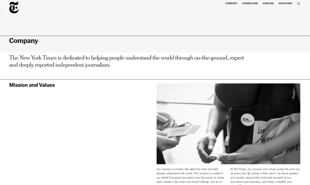
The official website of The New York Times divulges an extensive array of data on its ‘About us page’, encompassing statistics pertaining to both its workforce and readership. An imperative aspect of their communication strategy is to underscore to global audiences the substantial cadre of journalists who compose narratives with localized expertise on respective nations.
Of considerable significance is the fact that the publication garnered 8.8 million subscribers in the preceding year, further augmenting the credibility and engendering a higher readership trajectory for the forthcoming periods.
Wix – Creative, Number, and Road map
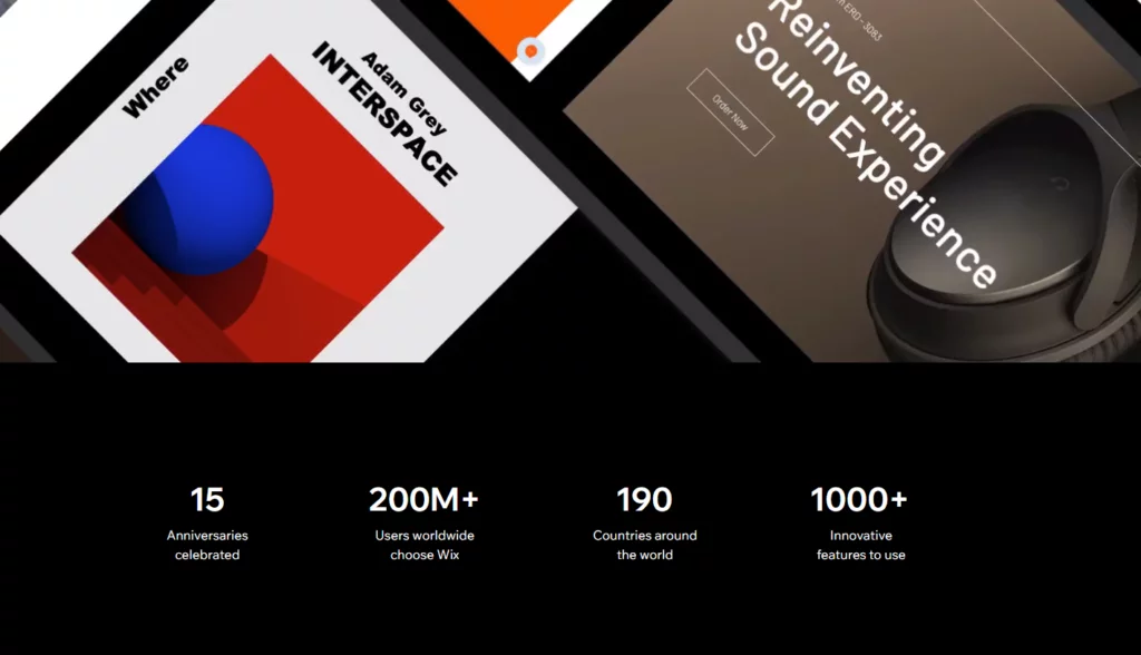
The Wix About Us page is useful and well-written. Visitors can easily grasp what Wix is, what it does, and who it is for thanks to this. The page has eye-catching graphics and movies of the highest caliber.
Even those unfamiliar with website builders will find the page to be simple to read and comprehend. In addition, Wix’s own language, branding, and tone of voice are used on the page. This fosters a sense of personal connection between users and Wix.
In general, I believe the Wix About Us website is a superb illustration of how to make an educational and interesting About Us page. It is informative, visually appealing, and personalized.
Visionaire – Eye-catching and Creative
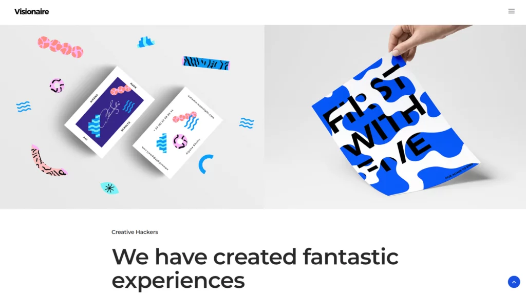
The design of Visionaire is straightforward yet occasionally inventive; it does not draw your attention away from it. They have included some slick text animation, better-quality photographs, the brand they deal with, and a straightforward explanation of their purpose.
Moreover, The consistent use of the recognizable Visionaire red color across the website design strengthens the connection between the brand and that particular color while also resulting in an eye-catching layout. Readers can quickly comprehend who Visionaire is because of the use of strong wording, wide blocks of color to split the material into digestible chunks, and clear imagery.
Pearls – Clean design
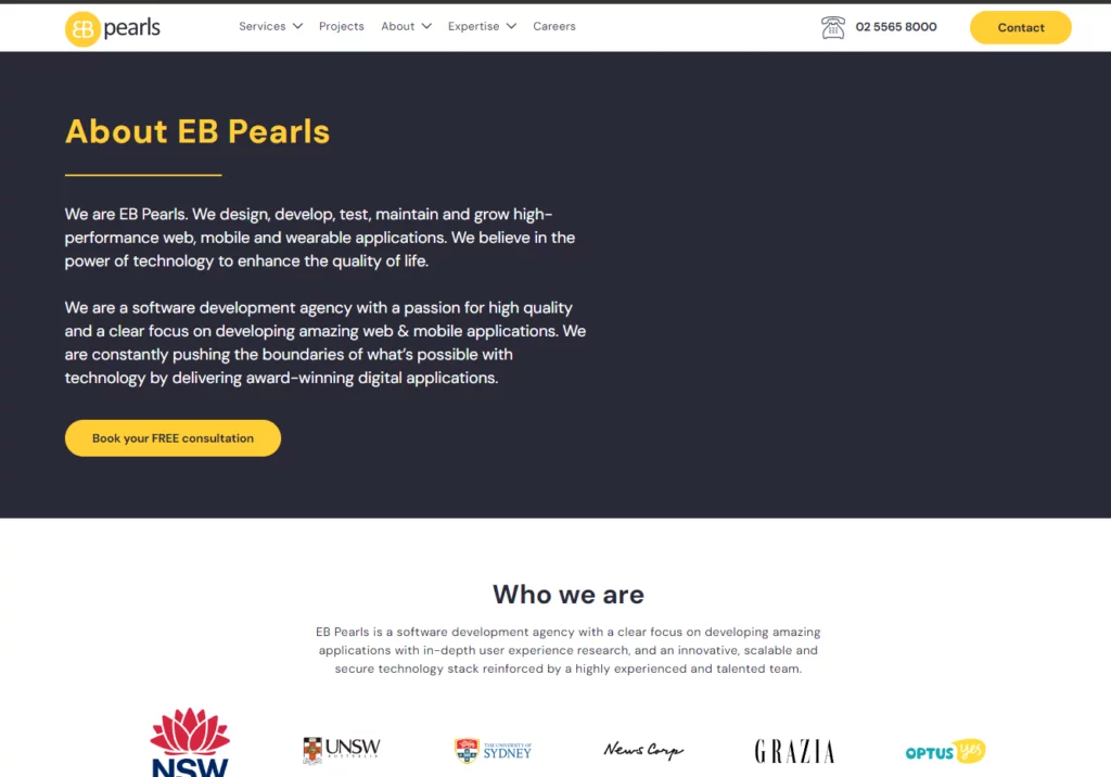
Do you want to create a cleaner, more polished About Us page? Take a page or two out of EB Pearls’ book, then pick a nice sans serif typeface, create a simple, light color scheme, and add some white space for good measure. Because of the abundant white space, the light typography, and the softly tinted artwork, this design exudes elegance, professionalism, and serenity.
The mission statement of EB Pearls, which is situated just beneath the primary picture, is one of the design’s key points of emphasis. While it’s generally accepted that using a large, strong typeface is the greatest way to grab attention, there are occasions when a lighter, finer typeface is exactly what the designer wanted.
Fantasy – Animation and bold type
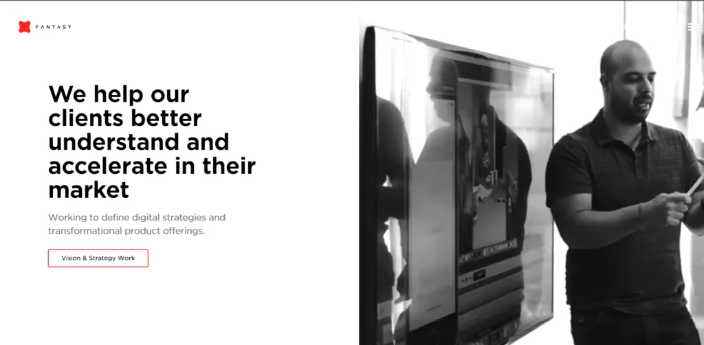
Do you want to give your design life, but are unsure how to do it? Why not venture into the world of animated images as Fantasy has? A developing trend in web design is the use of animated GIFs and films as background components since they may produce an immersive impression.
This About Us page is quite straightforwardly built, with simple black title text and a few red components to highlight crucial links and the company symbol, aside from the captivating full-screen dynamic backdrop elements.
Ginlane – Minimalistic with Gradient
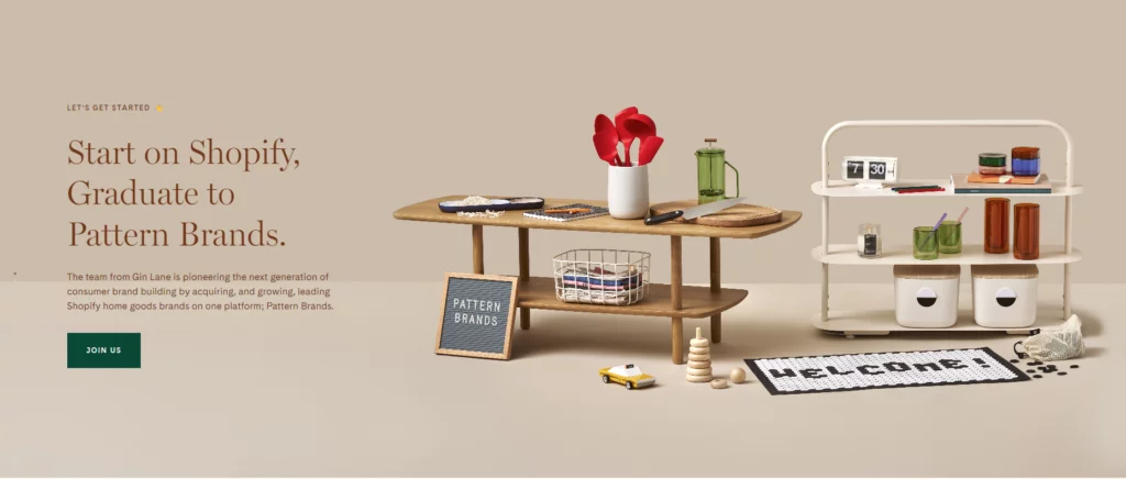
To create a unified look while integrating a lot of photos on your About Us page, strive to pick photos that go well together. Each image in this stunning and understated Gin Lane sample has the same color scheme of dark blacks, stark whites, and chilly tones.
Using filters to colorize all of your photographs similarly can help them look more coherent. In order to get a unified style, choose a filter that works for you and your project and apply it to each image. Filters are a miraculous one-click approach to recoloring and improving your images.
Twitch – Creative and Gaming time
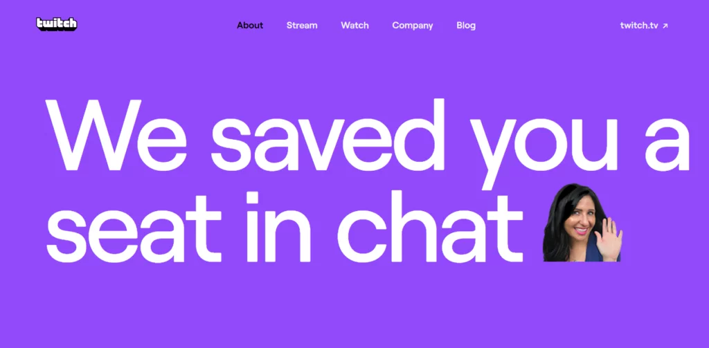
Twitch, a thriving gaming platform, is dedicated to infusing heaps of fun into its user experience. When crafting its ‘About Us’ page, Twitch keeps gaming at the heart of its design, ensuring that the essence of the platform shines through. Bursting with dynamic elements, it boasts images, big text, videos, gifs, and captivating text animations, creating an immersive and engaging environment for gamers and viewers alike. But that’s not all.
Twitch masters the art of employing a perfect color palette that seamlessly blends into their site, enhancing the overall visual appeal and complementing the gaming atmosphere. It’s no wonder Twitch stands out as a cool, visually stimulating, and entertaining hub for gamers worldwide.
Conclusion
About Us pages have evolved into more than just a basic introduction. They are the gateway to building meaningful connections with website visitors. Utilizing the right About Us page template can make a world of difference in establishing your brand’s identity and fostering trust among customers. Whether you choose “The Storyteller,” “Mission-Driven,” or any other template, remember to craft your content with authenticity, creativity, and a human touch. Keep your About Us page up to date, reflecting your brand’s growth and vision for the future.
FAQs on About Us Page
What information should I include on my “About Us” page?
Your About Us page should include a compelling narrative about your company’s journey, achievements, mission, and vision. Highlight team members, share customer testimonials, and showcase your brand’s identity.
How often should I update my About Us page?
It’s a good practice to update your About Us page whenever significant changes occur within your company or when you achieve important milestones.
Can I use video content on my About Us page?
Absolutely! Video content can be a powerful tool to engage your audience and tell your brand story in a visually compelling way.
Is it essential to have an About Us page for a small business?
Yes, an About Us page is essential for businesses of all sizes. It helps build trust and credibility, allowing you to connect with potential customers.

