Today, I’m thrilled to present a carefully curated selection of remarkable WooCommerce website examples.
These websites are not just online stores; they stand as testimonials of the incredible flexibility, creativity, and robust functionality offered by WooCommerce.
If you’ve ever wondered about the capabilities of WooCommerce in shaping online shops, prepare to be impressed.
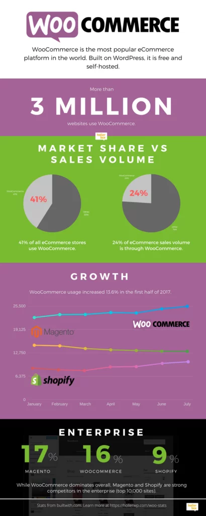
Fun Fact: WooCommerce powers nearly 30% of all online stores, making it a preferred choice among developers due to its adaptable, open-source nature.
With WooCommerce, developers can mold their online stores according to their requirements. A wide array of extensions compatible with the platform can significantly enhance your store’s functionality. Whether facilitating bookings, creating memberships, managing invoicing, or tracking deliveries right up to your customer’s doorstep, WooCommerce offers a comprehensive solution for online retailers.
Essentially, it provides everything you need to run a successful online store.
So, are you ready to embark on a journey to explore some truly remarkable WooCommerce websites?
Real Life Examples of WooCommerce Websites:
1. Joco Cups
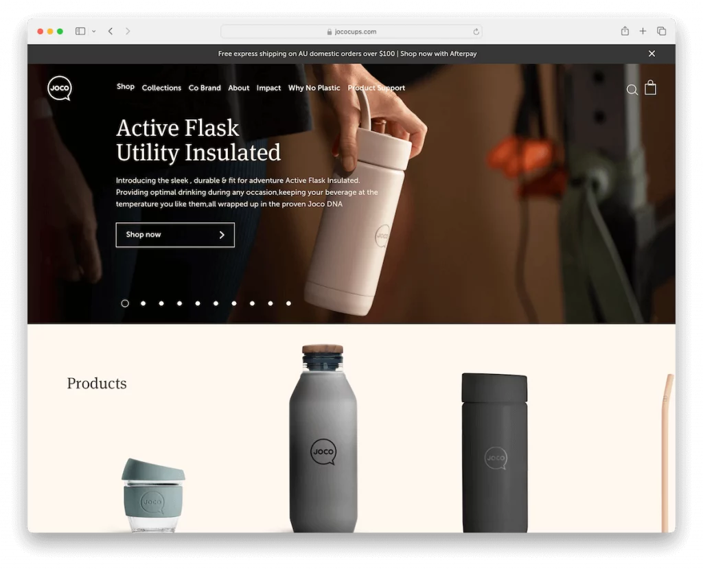
Joco Cups’ WooCommerce website stands out with its sleek design and intuitive features tailored for a water bottle store.
- Engaging Slider: The site features an engaging slider with clear call-to-action buttons, enhancing user interaction and directing attention to key products or promotions.
- Top Bar Notification: A noticeable notification alerts visitors to free shipping offers, encouraging conversion and boosting sales.
- Sticky Header: The transparent header transforms into a solid, sticky one upon scrolling, ensuring easy navigation throughout the site.
- Minimalist Mega Menu: A minimalist mega menu offers effortless browsing, allowing visitors to navigate product categories easily.
- Instagram Feed: Including an Instagram feed showcases community engagement, adding authenticity and trust to the brand.
- Simple Footer: A simple footer with useful links ensures seamless and user-friendly site exploration.
Why We Chose It: Joco Cups’ website combines exceptional functionality with an aesthetically pleasing design, creating a seamless shopping experience for customers
Revenue: $5.4 million
2. Porter & York
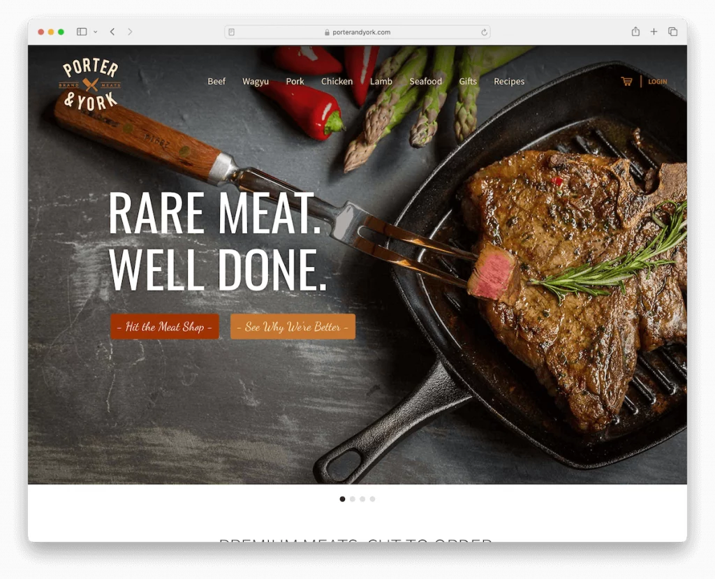
Porter & York’s WooCommerce site impresses with its simplicity and elegance, tailored for a food delivery service.
- Streamlined Navigation: The streamlined navigation bar features an intuitive cart and login icons, providing a hassle-free user experience.
- Prominent Slideshow: A prominent slideshow grabs attention, visually showcasing the brand’s premium products and enticing visitors to explore further.
- Grid Layout: A well-organized grid layout displays offerings, making product selection effortless and enjoyable. This reflects the brand’s commitment to quality.
- Why We Chose It: Porter & York’s website embodies elegant design, user-friendly navigation, and effective product presentation, creating an exceptional online shopping experience.
- Revenue: $5 million
3. Kawaii Box
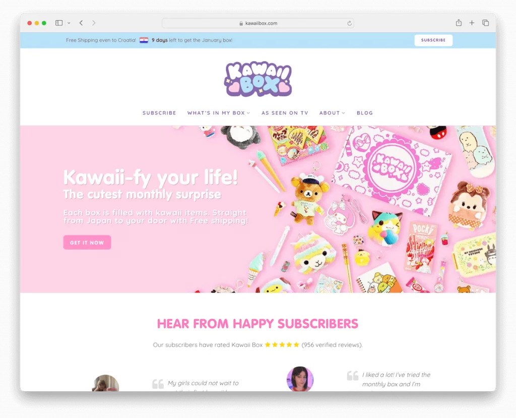
Kawaii Box’s WooCommerce site exudes vibrancy and playfulness, perfectly capturing the essence of its monthly subscription box service.
- Colorful Design: Vibrant, colorful design reflects the brand’s playful essence and appeals to its target audience.
- Top Bar Notification: Eye-catching top bar notification promotes special deals or offers, enhancing engagement and encouraging conversions.
- Floating Drop-Down Menu: A User-friendly floating drop-down menu ensures easy navigation, improving the user experience.
- Customer Reviews: Engaging customer reviews builds trust and community, showcasing the positive experiences of existing subscribers.
- Transparent Pricing: Transparent pricing plans are displayed, enabling customers to make informed choices about subscription options.
Why We Chose It: Kawaii Box’s website combines visually captivating design with user-centric features and transparent pricing, catering perfectly to its niche market.
Revenue: $2-5 million
4. Bike-Room
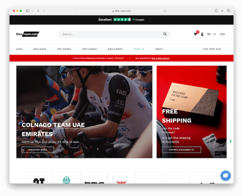
Bike-Room’s website sets a benchmark for international customer engagement. It features a language and currency selector popup to cater to a diverse global audience.
- Extensive Footer: The website boasts an extensive footer that neatly organizes all product links, ensuring effortless navigation for visitors.
- Live Chat Assistant: A live chat assistant widget enhances real-time customer support, providing personalized assistance to users and fostering trust.
- Search Bar with Live Results: Including a search bar with live results facilitates swift and intuitive product discovery, enhancing the overall user experience.
- Video Banners: Dynamic video banners add visual appeal, immersing visitors into the world of cycling and showcasing products in action.
Why We Chose It: Bike-Room’s website exemplifies user-focused features such as language selection, comprehensive navigation, and interactive elements, offering an outstanding global shopping experience.
Revenue: $2 million
5. Terzetto
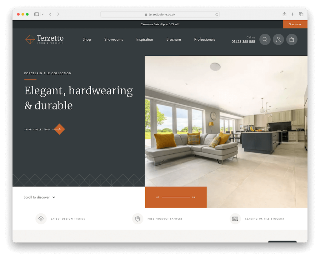
Terzetto’s website captivates visitors with its unique and engaging slider, instantly drawing them into its stylish world.
- Innovative Navigation: The top and main navigation bars cleverly disappear on scroll to reduce clutter, ensuring a seamless browsing experience.
- Dynamic Product Presentations: Various carousels enhance product presentations, allowing for a dynamic showcase of items and encouraging exploration.
- Testimonial Slider: A testimonial slider adds credibility and trust, providing social proof to potential customers.
- Comprehensive Footer: The three-column footer, complete with additional links, social icons, and a subscription form, ensures a comprehensive and user-friendly experience.
Why We Chose It: Terzetto’s website features a dynamic user interface, innovative navigation solutions, and inviting product displays, offering an engaging shopping experience.
Revenue: $3 million
6. Romagnoli
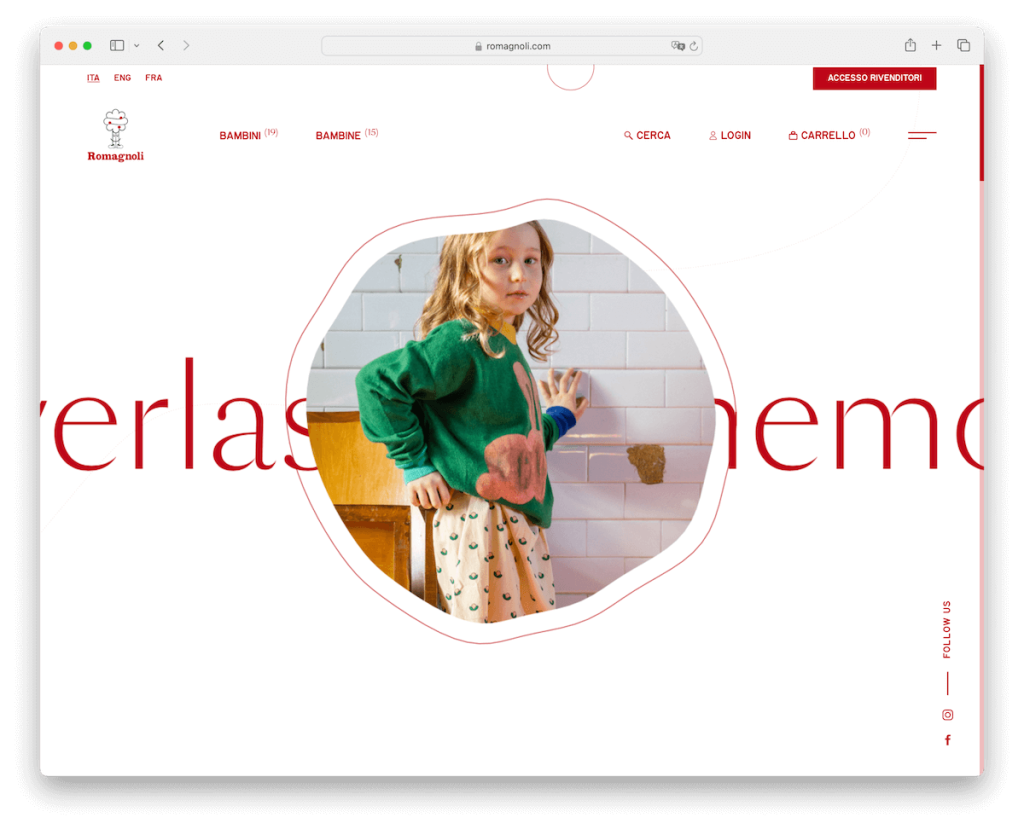
The Romagnoli WooCommerce site captivates with its artistic flair and innovative animations, creating a visually stunning browsing experience.
- Animated Image Frame: A cool animated image frame adds visual interest while sliding text in the background enhances the site’s dynamic feel.
- Transparent Sticky Header: A transparent sticky header offers seamless navigation without compromising the site’s elegant design.
- Hamburger Menu: The hamburger menu ensures a clutter-free interface, providing easy access to navigation options.
Why We Chose It: Romagnoli’s website incorporates artistic animations and minimalist design for a uniquely attractive and streamlined shopping experience.
Revenue: $40 million
7. Terratinta
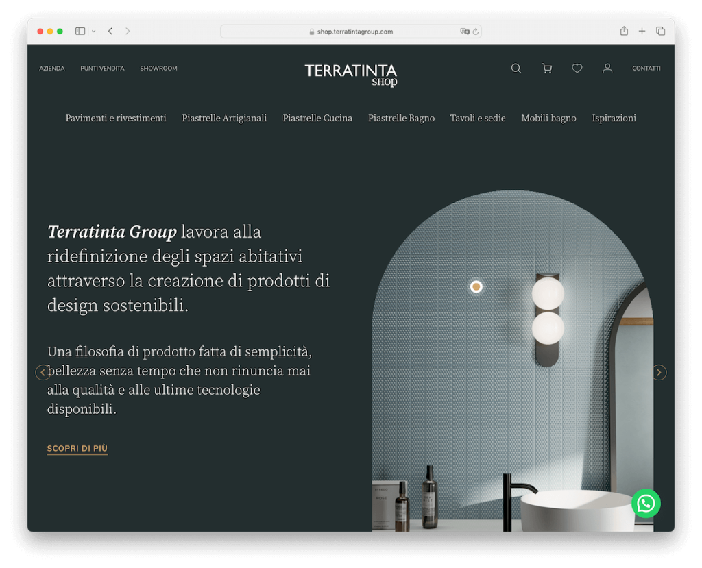
Terratinta’s website perfectly balances style and functionality, featuring a cohesive design and innovative interactive elements.
- Mega Menu: A mega menu facilitates effortless navigation across various products, enhancing users’ browsing experience.
- Unified Color Scheme: The consistent color background in the header, base, and footer underscores the brand’s identity and creates a sleek appearance.
- Split-Screen Slider: An original split-screen slider above the fold provides an engaging visual experience, showcasing products effectively.
- Sticky WhatsApp Chat Widget: The sticky WhatsApp chat widget ensures constant and convenient customer interaction, improving customer support.
Why We Chose It: Terratinta’s website displays design coherence, user engagement, and interactive features, offering an exceptional online shopping experience.
Revenue: $360 million (group revenue)
8. Montvel
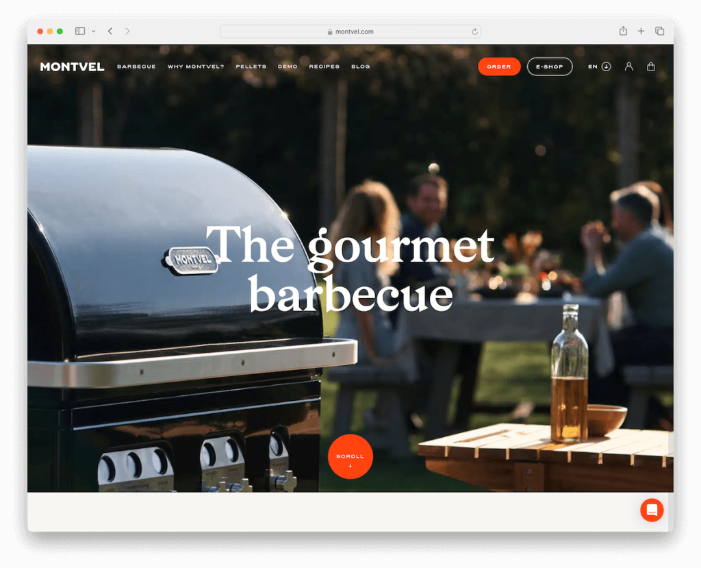
Montvel’s website epitomizes modern web design, featuring captivating elements that engage visitors from the moment they land on the page.
- Striking Parallax Background: A striking parallax background above the fold creates depth and movement, immediately capturing attention and setting a dynamic tone.
- Contrasting Top Bar Notification: A contrasting top bar notification draws the eye and effectively communicates essential messages or promotions to visitors.
- Clever Navigation Bar: The cleverly designed navigation bar disappears and reappears as users scroll, enhancing the browsing experience and ensuring easy access to navigation options.
- Scrolling Animations: Engaging scrolling animations add a dynamic touch to the website, enhancing user interaction and creating a memorable experience.
- Video Demonstrations: Quick video demonstrations provide an engaging way to showcase products and offer visitors a glimpse into the brand’s offerings.
Why We Chose It: Montvel’s website seamlessly integrates dynamic design elements like parallax backgrounds and scrolling animations, creating an immersive and interactive user experience.
Revenue: $500,000
9. Create Tattoos
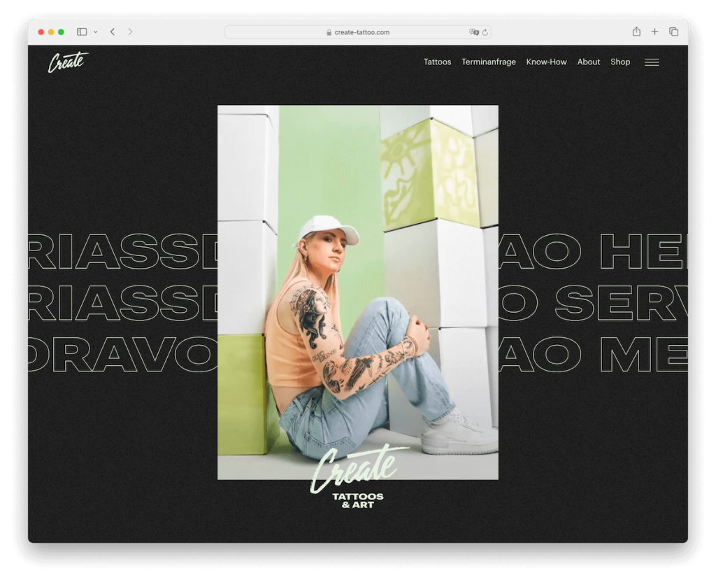
Create Tattoos’ website captivates visitors with its bold and creative design, showcasing its unique identity and artistic flair.
- Animated Image Collage: An animated image collage immediately captures attention, setting a dynamic and creative tone for the website.
- Animated Text Background: Animated text in the background adds an edgy and artistic flair, complementing the brand’s identity and enhancing visual appeal.
- Full-Screen Hamburger Menu: The full-screen hamburger menu reveals a split-screen design, offering users a unique and immersive navigation experience.
- Distinct Footer Design: The distinct footer design features neatly organized contact details and links, providing essential information while maintaining the site’s bold aesthetic.
Why We Chose It: Create Tattoos’ website represents a unique blend of flair and modern design, using animated elements and a bold dark theme to create a visually striking online presence.
Revenue: $200,000
10. Desi Daru
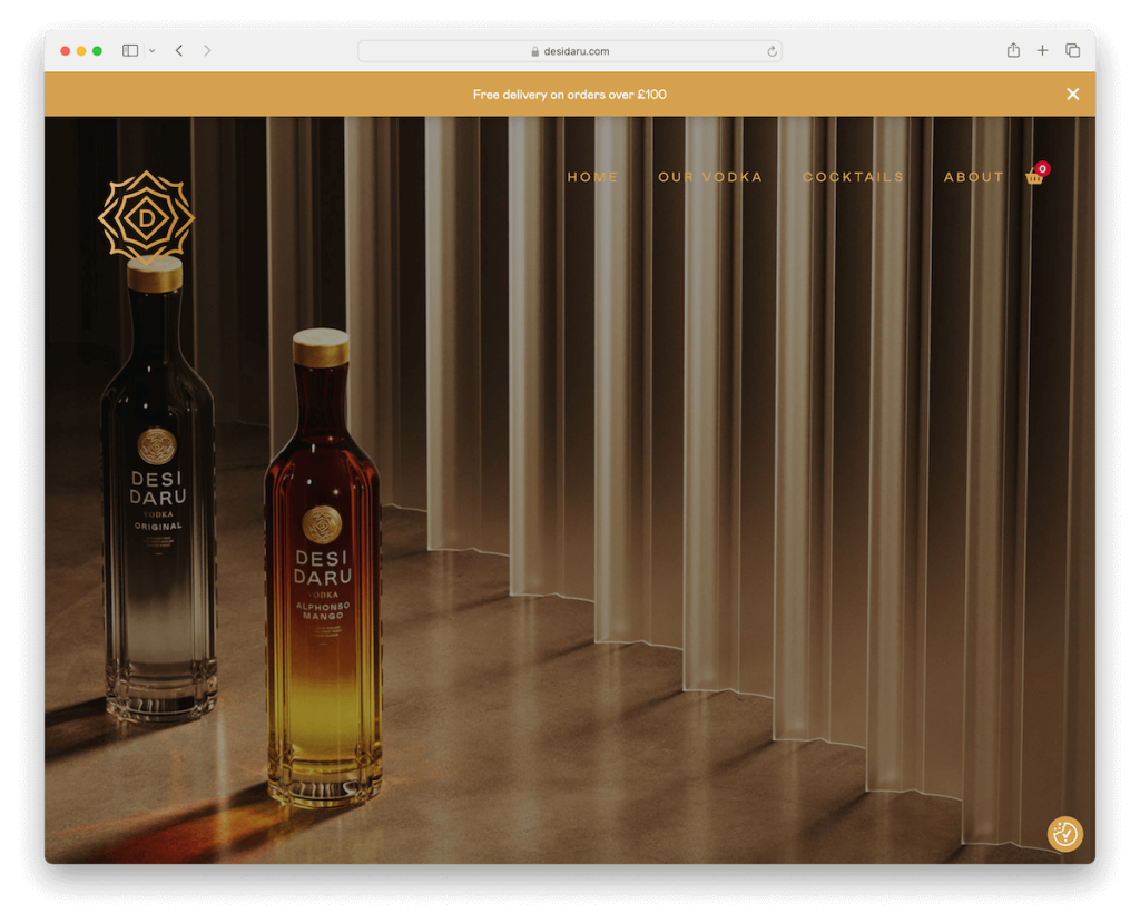
Desi Daru’s website makes a memorable impression with its captivating imagery and user-centric features, providing a seamless and engaging shopping experience.
- Gripping Full-Screen Image: A gripping full-screen image above the fold instantly captures attention, showcasing the brand’s unique identity and enticing visitors to explore further.
- Notification Bar: A notification bar informs customers about free delivery, enhancing the shopping experience and encouraging conversions.
- Transparent Menu: The simple, transparent menu enhances the site’s modern and uncluttered feel and ensures easy navigation for users.
- Distinct Footer Design: The distinct triangular footer design houses essential links and information, providing a visually appealing and functional element to the website.
Why We Chose It: Desi Daru’s website combines eye-catching visuals with user-centric features for a distinct and engaging online presence.
Revenue: $300,00011
11. Evotion Pro
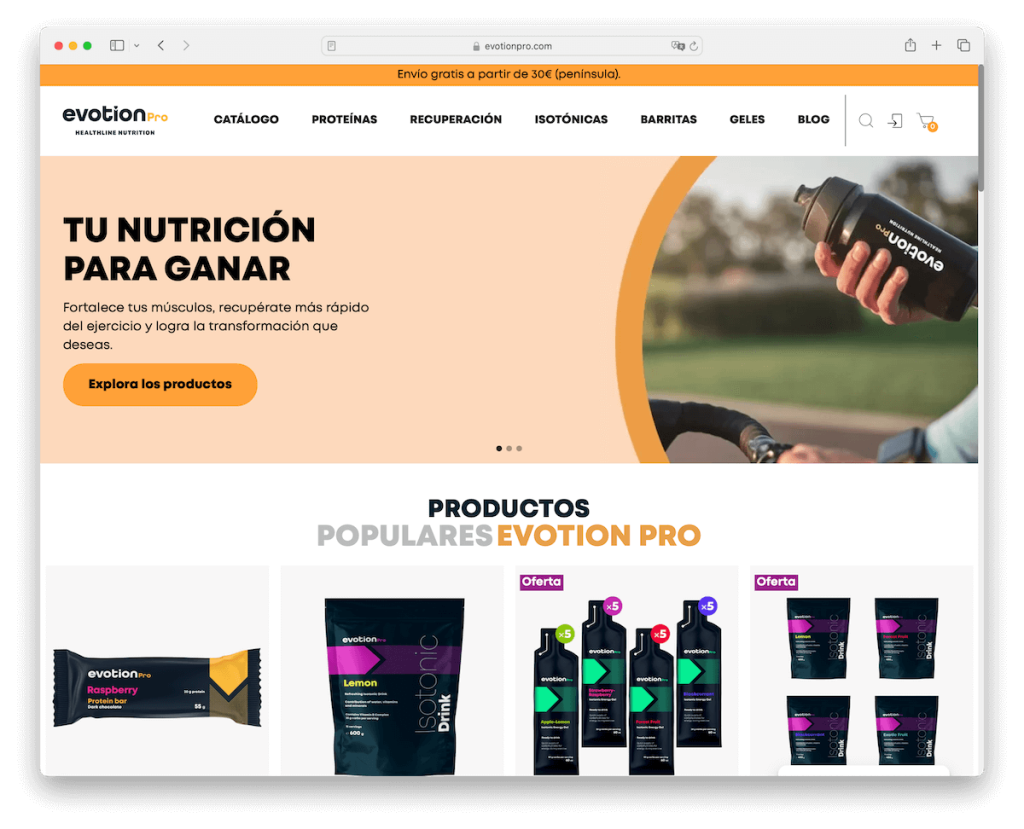
Evotion Pro’s WooCommerce site exudes sophistication and interactivity, featuring captivating design elements and seamless user experiences.
- Engaging Slider and Product Carousel: An engaging slider leads visitors into a dynamic product carousel, effectively showcasing popular offerings and encouraging exploration.
- Subtle Animations: Subtle animations enrich the scrolling experience, adding a touch of sophistication and enhancing user engagement.
- Contrasting Footer: A standout dark footer sharply contrasts with the rest of the site, drawing attention to important links and information while maintaining visual appeal.
- Search Bar with Live Results: The search bar with live results ensures smooth and efficient product discovery, providing users instant access to relevant information.
Why We Chose It: Evotion Pro’s website seamlessly combines interactive elements with sleek design for a captivating and memorable user journey.
Revenue: $1 million+
12. Impuzzables
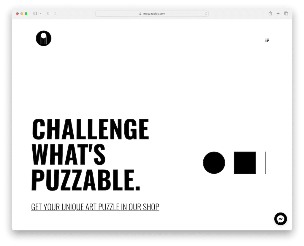
Impuzzables’ minimalist website design focuses on clean aesthetics and user-friendly features, providing visitors with a seamless and enjoyable browsing experience.
- Minimalist Design: Bold typography and generous white space create a clean and focused user experience, allowing products to take center stage.
- Floating Messenger Widget: A floating widget adds real-time customer engagement, enhancing user interaction and fostering connections.
- Large Slideshow: A large slideshow effectively showcases products, capturing visitor interest and encouraging exploration.
- Contrasting Footer: The contrasting footer neatly houses essential links and information, balancing class with practicality and enhancing site navigation.
Why We Chose It: Impuzzables impresses with its minimalist design, engaging product showcase, and user-friendly features, offering a seamless online shopping experience.
Revenue: $300,000+
How to Create a Website With WooCommerce:
Creating a website with WooCommerce allows you to set up an online store quickly and efficiently. Here’s a detailed guide on how to make a website with WooCommerce:
- Select a domain name and hosting provider: Choose a memorable domain name for your website. Use a domain name generator to brainstorm ideas. Once you have a domain name, choose a reliable hosting provider that supports WordPress and WooCommerce. Look for hosting providers that offer optimized WooCommerce hosting packages to ensure smooth performance for your online store.
- Install WordPress: Most hosting providers offer 1-click installation process for WordPress. Log in to the hosting account, navigate to the control panel, and choose the option to install WordPress. Follow the prompts to complete the installation process.
- Select a WordPress theme: Choose a WooCommerce-compatible WordPress theme for the online store. You can browse the wide selection of themes in the WP theme repository or opt for premium themes from reputable developers. Ensure your chosen theme is responsive, customizable, and optimized for eCommerce.
- Install WooCommerce: Once WordPress is installed, navigate to the WP dashboard and go to Plugins > Add New. Search for the WooCommerce and click on the Install Now button. After installation, activate the plugin and follow the setup wizard to configure your store.
- Set up your store: The WooCommerce setup wizard will guide you through configuring your store. You must enter your store’s location, currency, payment methods, and shipping options. Take the time to carefully configure each setting according to your preferences and business requirements.
- Add products to your store: To include products, go to the WooCommerce section in the WP dashboard and click on “Add Product.” Fill out the product details, including the product name, description, price, and images. You may also set up product categories and tags to organize your inventory effectively.
- Customize and test your website: Once your store is set up and populated with products, customize the layout of your website using your chosen theme’s customization options. You can even install additional plugins to add functionality to the store, like social media integration, email marketing tools, and advanced analytics. After customizing your website, thoroughly test it to ensure everything works correctly, including the checkout process, payment gateways, and shipping options.
Conclusion:
WooCommerce websites exemplify the platform’s versatility, customization options, scalability, integration capabilities, user experience, performance, and community support. Businesses looking to establish a strong online presence and drive e-commerce success can leverage WooCommerce to create engaging and profitable online stores tailored to their unique needs and objectives.
WooCommerce Website FAQs:
Can WooCommerce handle high traffic?
Yes, WooCommerce can handle high traffic, but its performance depends on factors like hosting service quality and site optimization.
Is WooCommerce SEO-friendly?
Yes, WooCommerce inherits many of WordPress’s SEO capabilities and supports numerous SEO plugins for further optimization.
Does WooCommerce support multiple payment gateways?
WooCommerce supports multiple payment gateways, including popular options like PayPal and Stripe.
Can WooCommerce handle different types of products?
Yes, WooCommerce is versatile and can handle various product types, including physical goods, digital downloads, and subscription-based products. Extensions and plugins are available for effective management.

